Accessibility
Reduced motion, contrast, transparency, text size, focus rings, keyboard and screen reader support in kanman.
kanman should work for everyone on your team, whether they use a mouse, a keyboard, a screen reader or a large font size. This page lists the accessibility settings and how the app supports assistive technology.
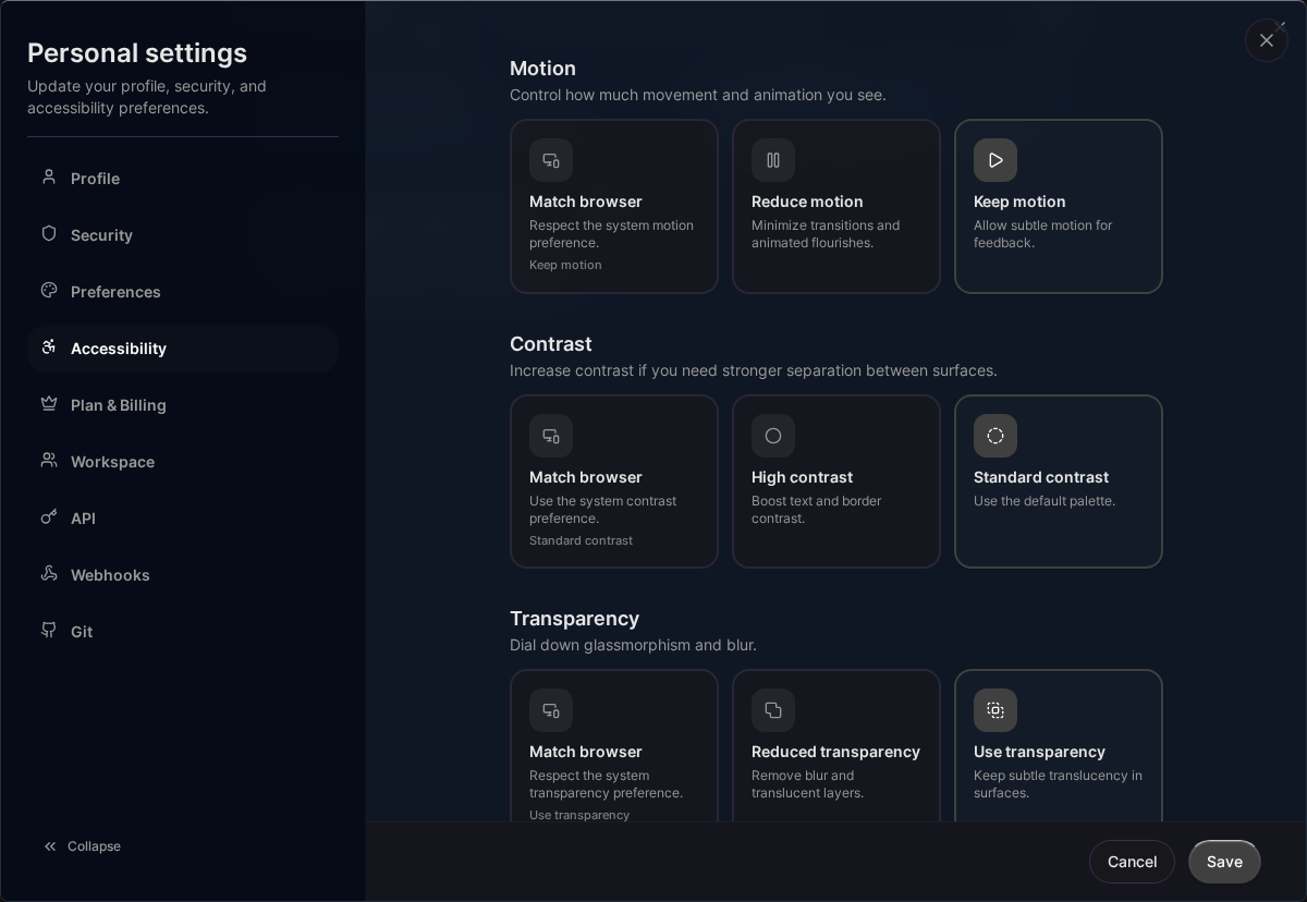
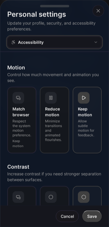
Accessibility settings
Click your avatar in the header, choose Settings and open the Accessibility tab (/settings?tab=accessibility). Click Save to apply your choices; they follow your account to every device.
For motion, contrast and transparency, Match browser (the default) follows the setting of your operating system or browser, so you only need to change them here if you want kanman to behave differently.
Reduced motion
kanman uses short transitions, for example when a story moves to the next column or a run advances to the next stage. Choose Reduce motion and these changes happen instantly: no sliding cards, no animated progress, no smooth scrolling. Keep motion always shows the transitions.
High contrast
High contrast makes borders, text and interactive elements more distinct. It helps with low vision, colour vision deficiencies and bright environments. Standard contrast is the regular look.
Reduced transparency
Reduced transparency replaces translucent surfaces and background blur with solid colours. This improves readability, especially on team pages with a wallpaper. Use transparency keeps the translucent look.
Text size
| Setting | Effect |
|---|---|
| Standard | Default size |
| Comfortable | Slightly larger text |
| Large | Clearly larger text |
Text size affects navigation, buttons, labels, story cards, the run page and the decision inbox. For larger changes, combine it with your browser zoom.
Focus ring
| Setting | Effect |
|---|---|
| Default focus | Standard focus outline |
| Strong focus | Thicker, high-contrast focus outline |
Status is never colour alone
Run stages, gate results and acceptance criteria always combine colour with an icon and a word, for example “Passed”, “Failed” or “Spec: red (expected)”. The evidence pack uses the same words in pull request and tracker comments, so it also reads correctly in tools without colour.
Keyboard
Everything in kanman can be done with the keyboard:
TabandShift+Tabmove between controls,EnterandSpaceactivate them.Escapecloses dialogs and panels.Ctrl+P(Cmd+Pon Mac) opens the command palette.- Decisions can be answered with the keyboard: each option is a button.
See Keyboard shortcuts for the full list.
Screen readers
- Pages use landmarks (navigation, main content) and a correct heading order.
- Buttons and links have descriptive labels, including icon-only buttons.
- Dialogs have proper roles and move focus into the dialog and back.
Standards
kanman aims to meet WCAG 2.1 level AA and EN 301 549. Text contrast is at least 4.5:1, large text at least 3:1.
Reporting a problem
If something does not work with your assistive technology, write to [email protected]. Tell us the page, what you tried and which assistive technology you use.
Related pages
Last updated: January 1, 0001
Open kanman